Branding & Visual Identity
 & Full-Stack.

Our Process
Brand Discovery and Positioning
We audit your current brand, interview stakeholders and study competitors to define positioning, audience and the strategic territory your identity needs to own.
Visual Territories and Concepts
We design two to three distinct creative directions, each with logo, color and type explorations, so you can react to real options rather than abstract mood boards.
Identity System Build-Out
Once a direction is chosen we refine the logo into a full system, set the color palette, typography scale, iconography and layout rules across the formats you actually use.
Guidelines and Asset Handover
We package everything into brand guidelines plus production-ready logo files, templates and social assets, and walk your team through applying them consistently.
A brand people recognise in a glance and trust on sight
erikservice builds identity systems that connect a sharp strategic position to a visual language flexible enough to live everywhere your audience meets you.
Our Benefits
You get a positioning-led identity, not just a logo, so the visuals are backed by a clear strategic reason to exist.
You receive a full system that flexes from favicon to billboard, instead of a single file that breaks the moment it leaves the page it was designed on.
You leave with guidelines and editable templates your team can run with, so the brand stays consistent long after the project ships.
More than a logo: a system built to scale
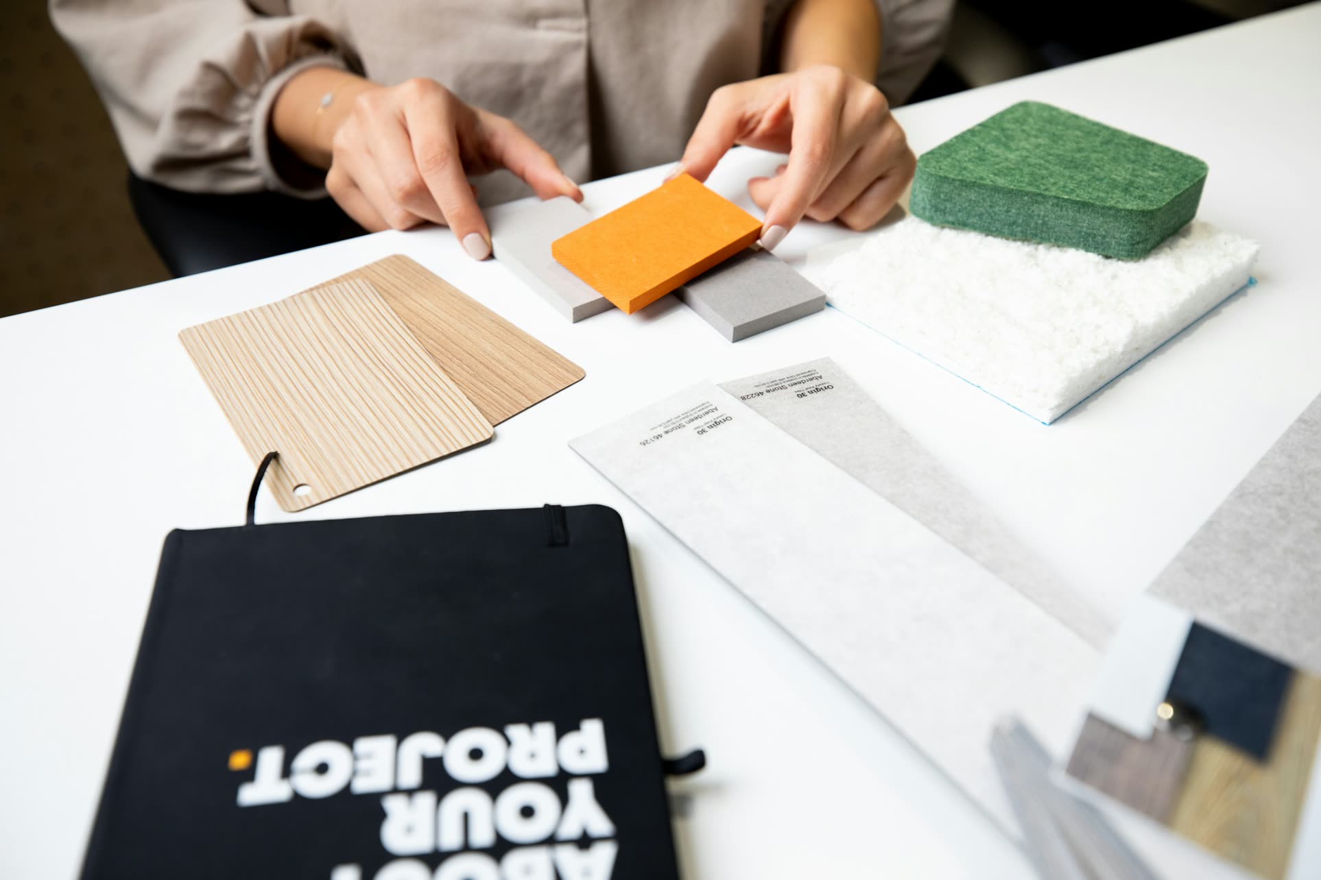
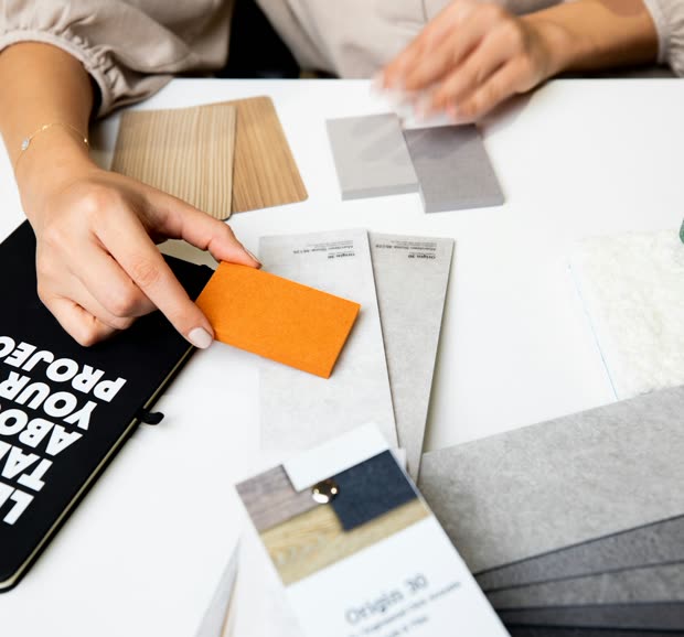
A logo is the part everyone notices, but it is the smallest part of what we deliver. Real brand equity comes from a system, the consistent relationship between your mark, color palette, typography, photography style, iconography and layout that makes your business recognisable even with the logo cropped out. We design that system from a defined position: who you are for, what you stand against, and the single idea your identity should communicate before anyone reads a word. That strategic foundation is what stops a rebrand from being decoration and turns it into an asset.
We also design for the places your brand actually lives. A mark that looks elegant on a presentation slide can fall apart at favicon size, in a single color, or stitched onto merchandise, so we build responsive logo variants, light and dark treatments, and clear spacing and minimum-size rules from the start. The same discipline carries into the assets your team uses every week: social templates, ad layouts, email headers, and pitch and investor decks that hold the same standard as your homepage. Everything ships with brand guidelines and editable source files so your identity stays coherent whether we apply it or your in-house team does.
Our Approach
We treat identity as a strategic problem first and a visual one second, so every design decision traces back to a reason your audience can feel.
-
Strategy before pixels
We lock positioning, audience and brand idea before designing anything, so the visuals have a job to do rather than just looking nice.
-
Systems, not one-offs
Every element is designed to work as a flexible kit across digital, print and motion, not as a single asset that breaks under real-world use.
-
Built to be handed over
Clear guidelines, organised source files and templates mean your team can keep the brand consistent without coming back for every small asset.