
Design Systems
 & Full-Stack.

Our Process
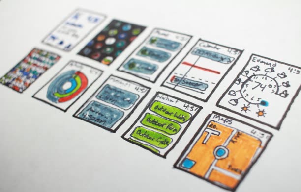
UI Audit and Inventory
We catalogue every existing component, color, and spacing value across your products to find duplication and define the true scope of the system.
Token and Foundation Design
We establish the primitive layer first, color, typography, spacing, radius, and elevation as design tokens that feed both Figma and code from one definition.
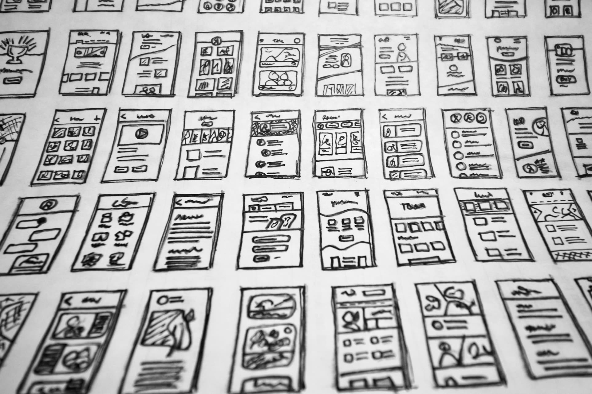
Component Build and Documentation
We build accessible, production-ready components in your stack alongside a living docs site with usage guidelines, props, and do-and-do-not examples.
Rollout and Governance
We migrate live screens onto the system, set up versioning and a contribution process, and train your team to extend it without our help.
One source of truth for every screen you ship
When design and code draw from the same tokens and components, consistency stops being a manual chore and becomes the default. Your team moves faster because the hard decisions are already made.
Our Benefits
We ship components in your actual stack, React, Vue, or web components, not just a Figma file that drifts out of date.
Our token architecture lets you launch a second brand or a dark theme by swapping values, not rebuilding screens.
We treat accessibility and documentation as part of the build, so every component ships WCAG-compliant and ready to use on day one.
Consistency that holds as your team scales
Most UI inconsistency is not a discipline problem, it is a tooling problem. When buttons are rebuilt on every screen and colors are pasted as hex values, drift is inevitable the moment more than one person touches the product. A design system fixes this at the root by centralizing the decisions: a token defines a color once, a component encodes a pattern once, and every screen inherits from that single definition. erikservice structures systems in clear layers, primitive tokens feeding semantic tokens feeding components, so a change at the foundation propagates everywhere automatically and predictably.
The hard part is not building components, it is building components people actually adopt. We invest heavily in Figma-to-code parity so a designer dragging a card and an engineer importing one get identical results, named the same way, behaving the same way. We pair that with documentation that answers the real questions, when to use this versus that, what props exist, what the accessibility contract is, and a governance model so the system keeps growing after we hand it over. A design system that no one trusts gets abandoned; we build ones teams reach for first.
Our Approach
We build design systems as living products, not static deliverables, grounded in your real interfaces and owned by your team from day one.
-
Tokens before components
We define the foundational layer first so theming, dark mode, and rebrands are config changes rather than rewrites.
-
Parity between design and code
Figma libraries and the code library mirror each other in naming and behavior, so handoff stops being a translation step.
-
Built for adoption
Clear docs, sensible defaults, and a contribution process mean the system gets used and extended instead of bypassed.